Designing a creator economy MVP where participation feels recognized
Role
Product Designer
Project type
Client MVP
Industry
Creator Economy · Live Streaming · Social Entertainment
Scope
Product definition · UX structure · User flows · Mobile experience · Interaction design · Visual direction
01The short version
Velora came to me as a client MVP for a live creator platform. The idea had room to become much bigger than a first release, so the challenge was not simply designing streaming screens.
I needed to turn the concept into a focused mobile experience that made it easy to discover creators, join live moments, interact, support, and start building a visible identity inside the community.
I approached the product as both a UX and an engagement problem. It needed to feel social and rewarding without making the experience complicated or turning every interaction into a game.
02The client asked for an MVP
The idea was bigger than the first product needed to be.
Live creator platforms can quickly become complicated. There are creators, viewers, live rooms, discovery, profiles, engagement, rewards, status, virtual goods, rankings, and many possible systems around them.
But an MVP cannot prove all of those ideas at once. My first job was to think about the smallest experience that could still communicate what made Velora different.
The product needed a clear reason to enter, participate, and return.
03I started with the core experience
What should someone actually be able to do in Velora before we add everything else?
The experience needed to make a few things immediately understandable:
Find creators and live experiences
Enter a live room without friction
Understand who the creator is
Interact with what is happening
Support creators
See that participation has value
Build an identity inside the product
This gave me a clearer foundation for the MVP than starting with a long feature list.
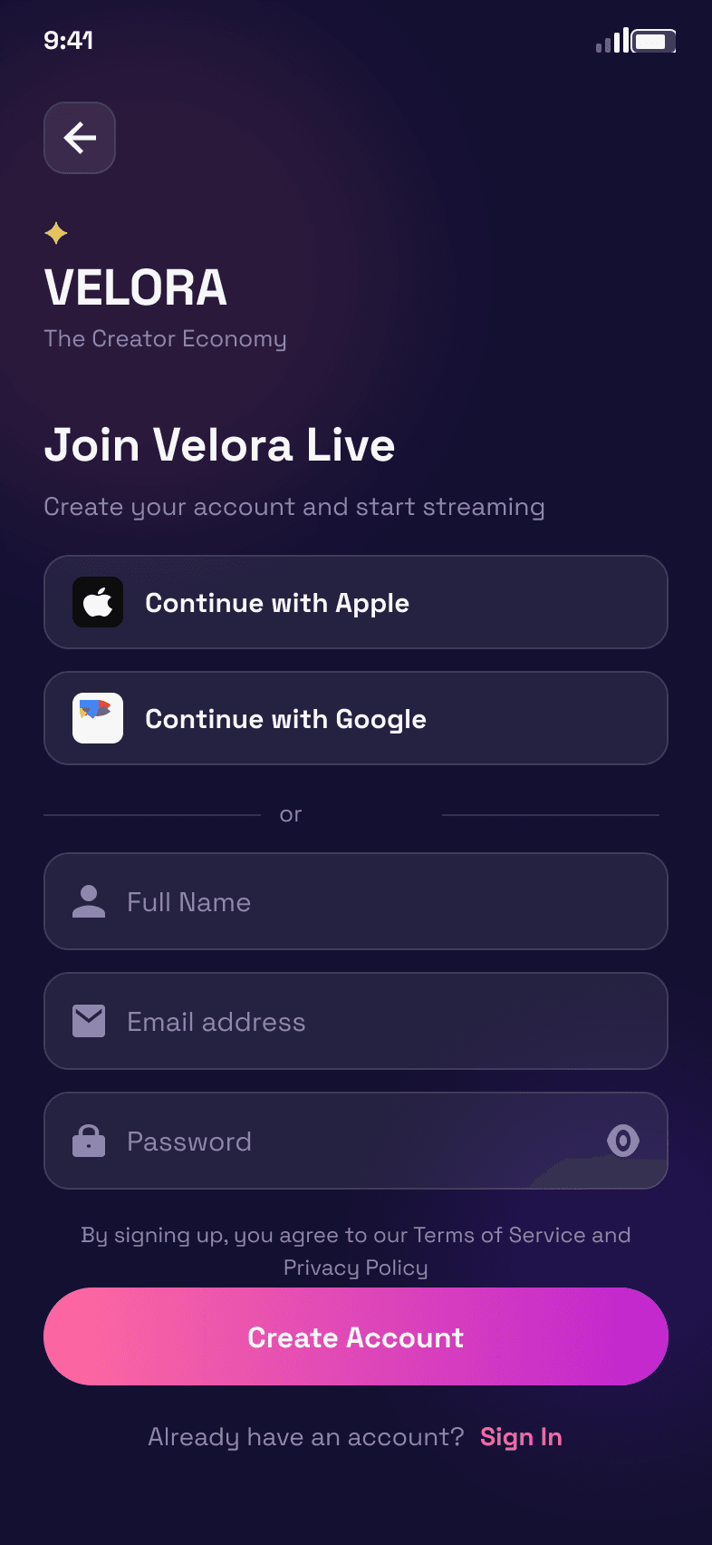
Create account · the shortest path in
Home · the returning view
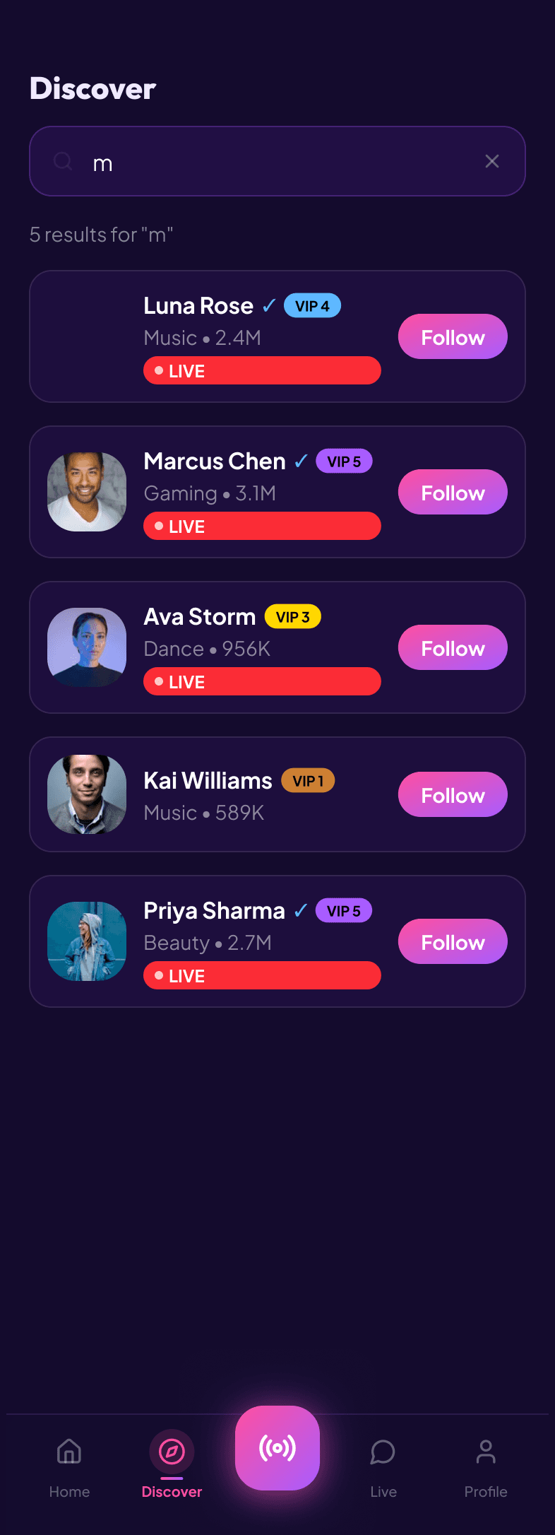
Search · for when intent is already formed
04Watching was only part of the experience
A traditional live-streaming experience can make most people passive. They enter. They watch. They leave.
Velora had the opportunity to make participation more visible. That changed how I thought about the experience. Instead of only asking how to make live streaming easy, I was also asking:
How do I make someone feel that their participation matters?
That thinking affected the relationship between live content, interaction, rewards, profiles, and status throughout the experience.
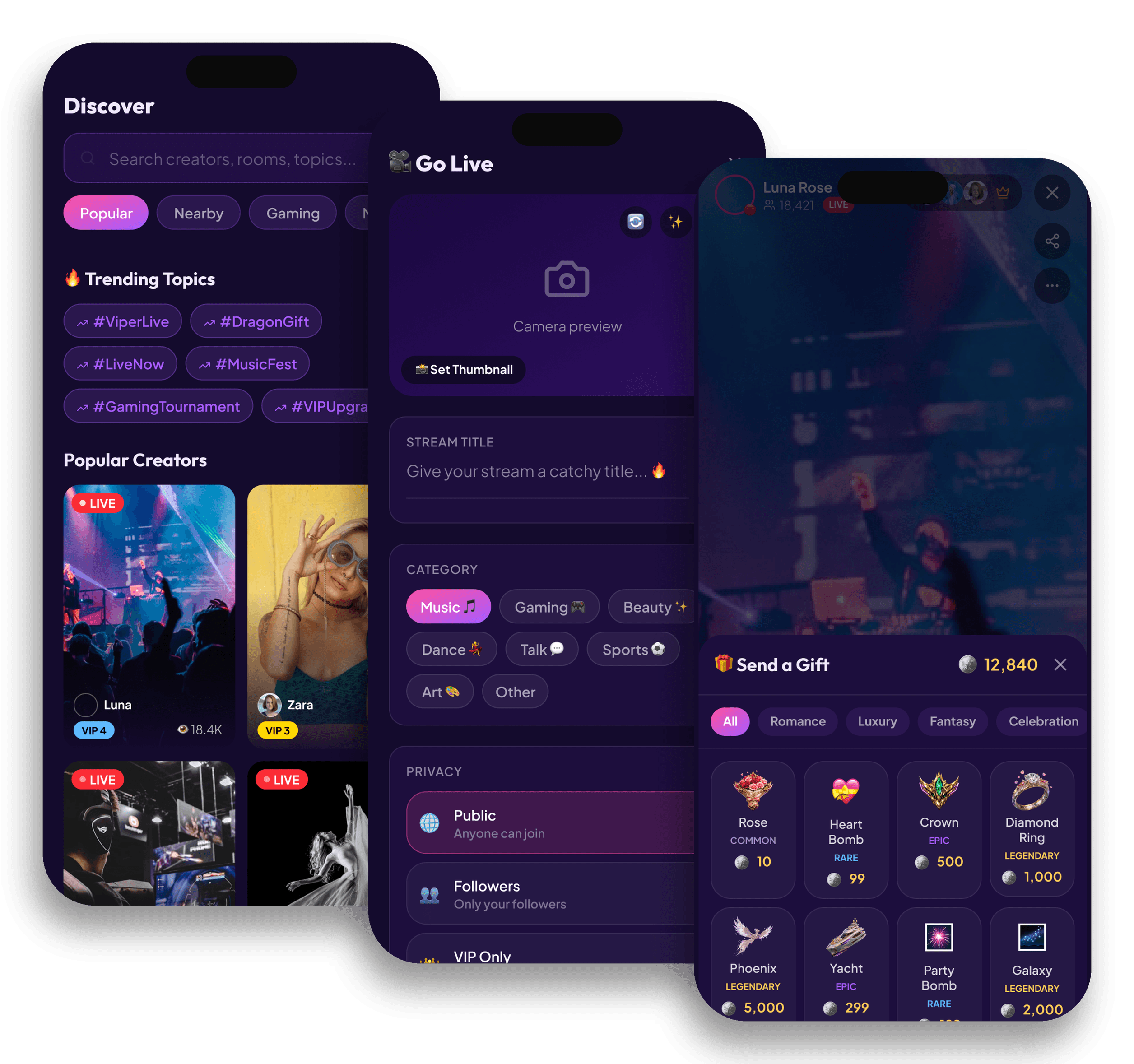
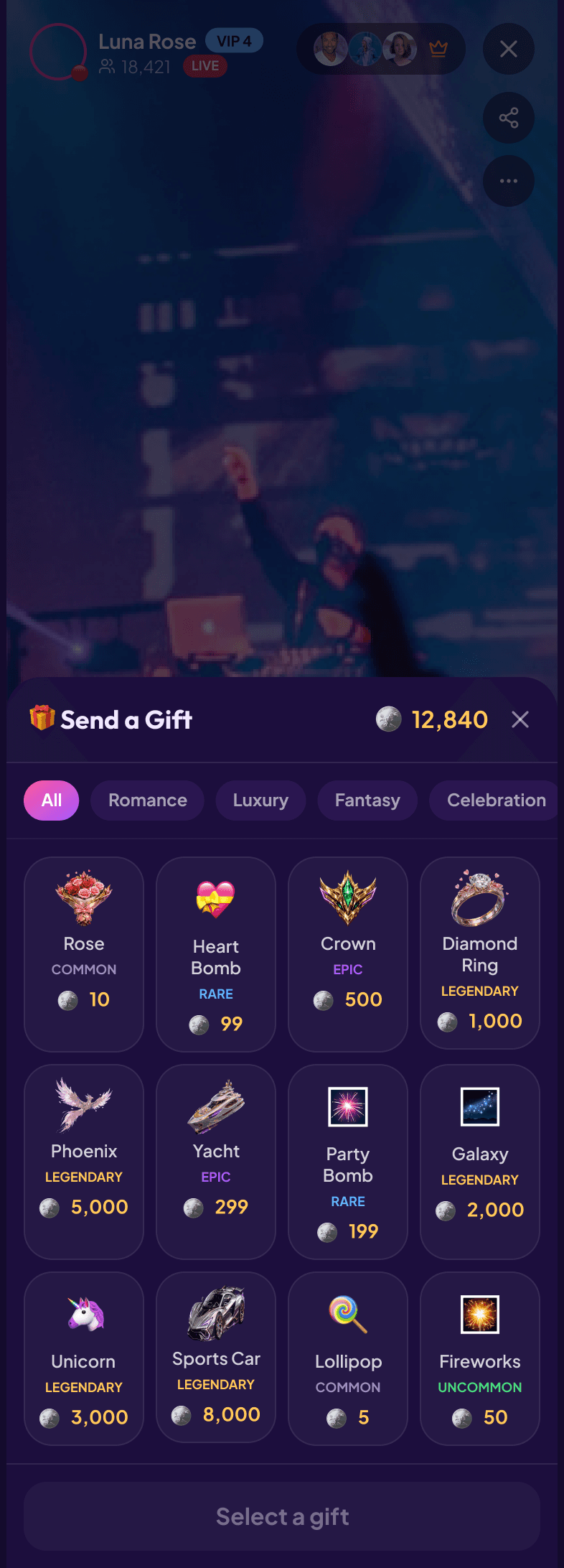
A live room with the gift sheet open · the moment participation becomes visible
05Designing around recognition
Supporting a creator should not feel like an invisible transaction. Participation should create some form of acknowledgement.
That meant thinking about things like:
Visible identity
Social feedback
Rewards
Progress
Collectible elements
Status
Recognition inside the community
The goal was not to add gamification everywhere. It was to make the social relationship between creators and supporters feel more meaningful.
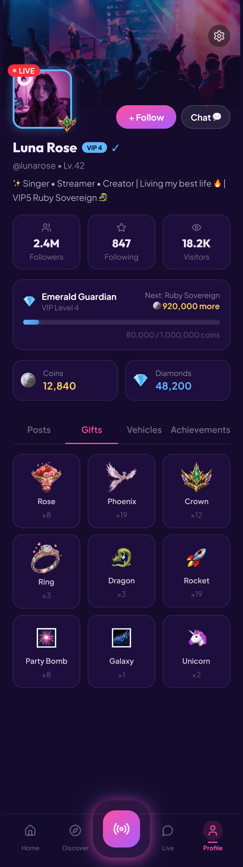
Gifts received · support made part of the profile
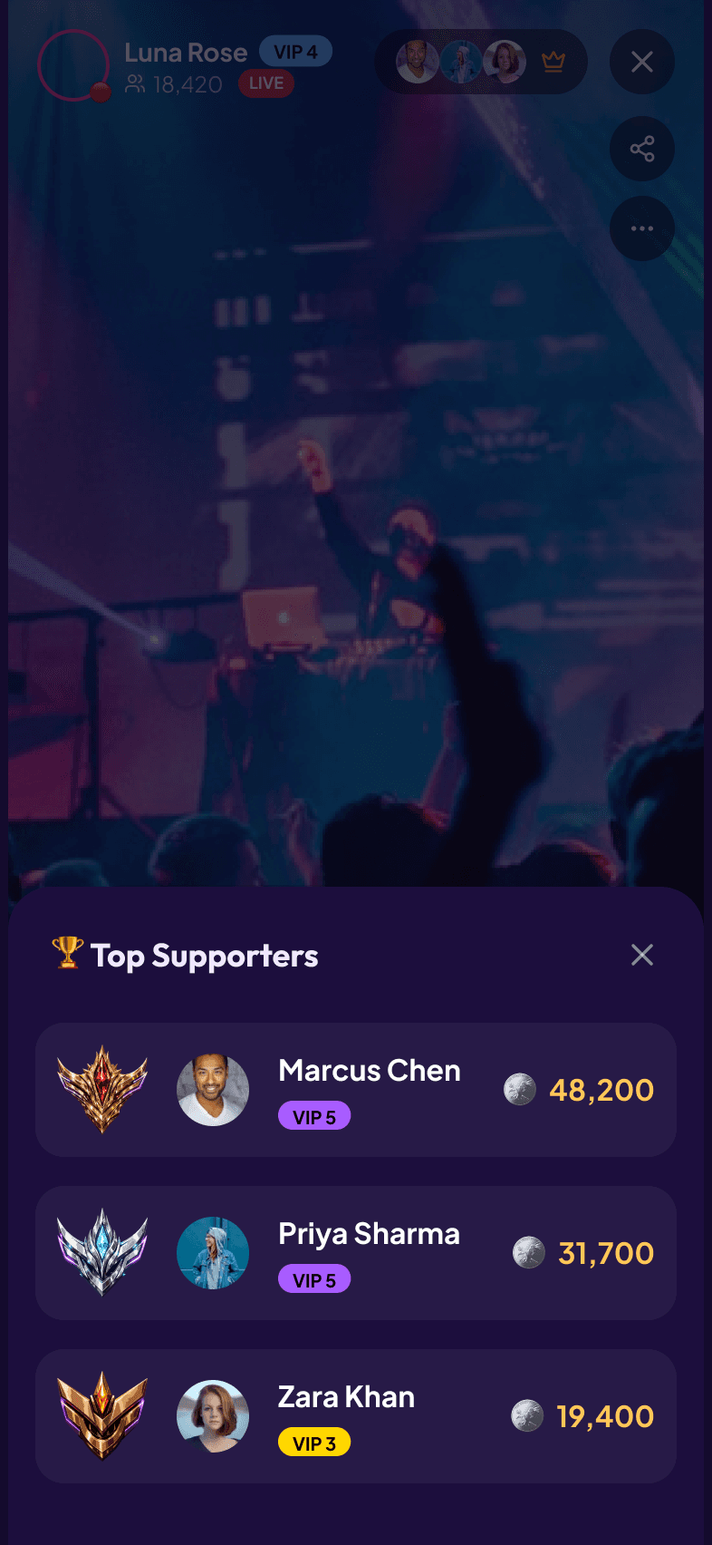
Top · recognition inside the community
06Progress needed to be understandable
Reward systems can become confusing very quickly. If users do not understand:
Where they are
What they have earned
What comes next
Why something matters
then the system becomes decoration instead of motivation. I wanted progress to feel visible without overwhelming the core experience.
Progression belonged in the information hierarchy, not as a layer added after the interface was already designed.
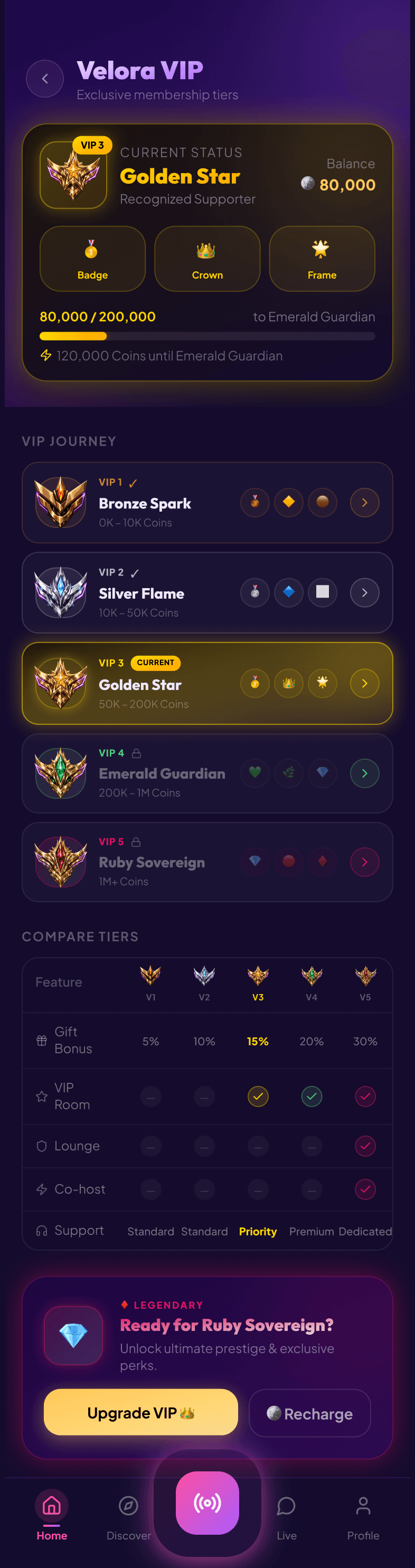
VIP · where you are, and what comes next
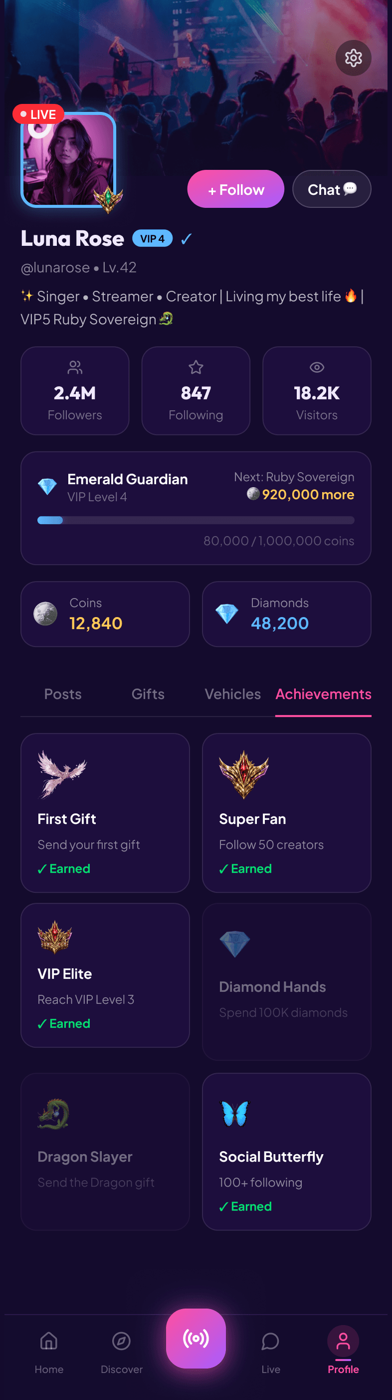
Achievements · progress made legible
07Identity was part of the product
Velora was not only about discovering creators. The user also needed a sense of:
Who am I inside this community?
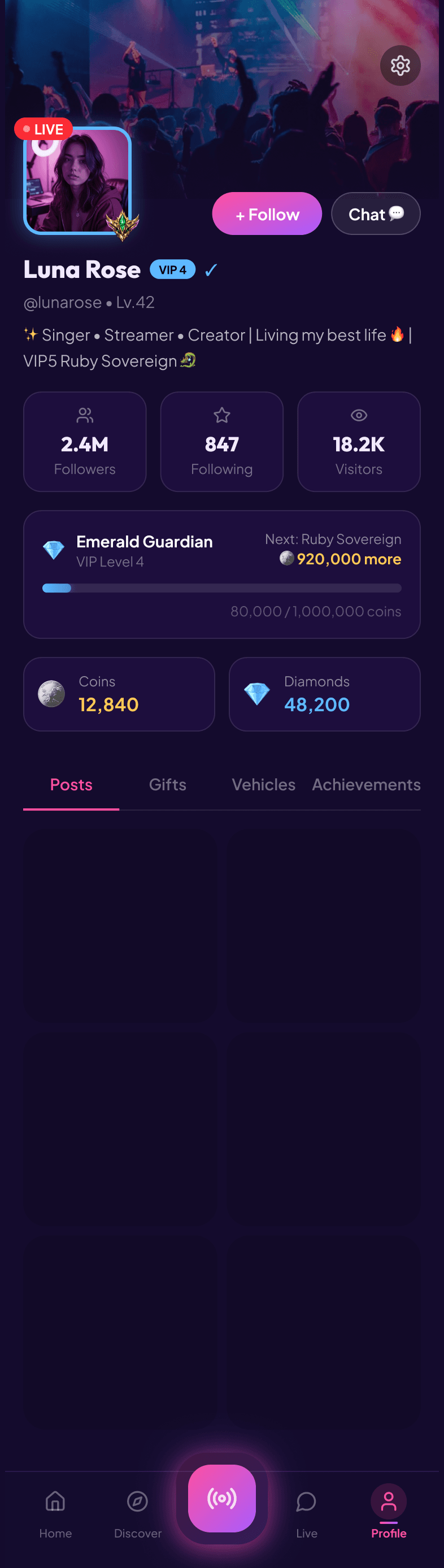
That made profiles and status more important than a standard account page. Identity could eventually be expressed through recognition, rewards, visual status, and collectible elements.
The interface needed to leave space for that system to grow while keeping the MVP understandable.
Profile · status, not just an account page
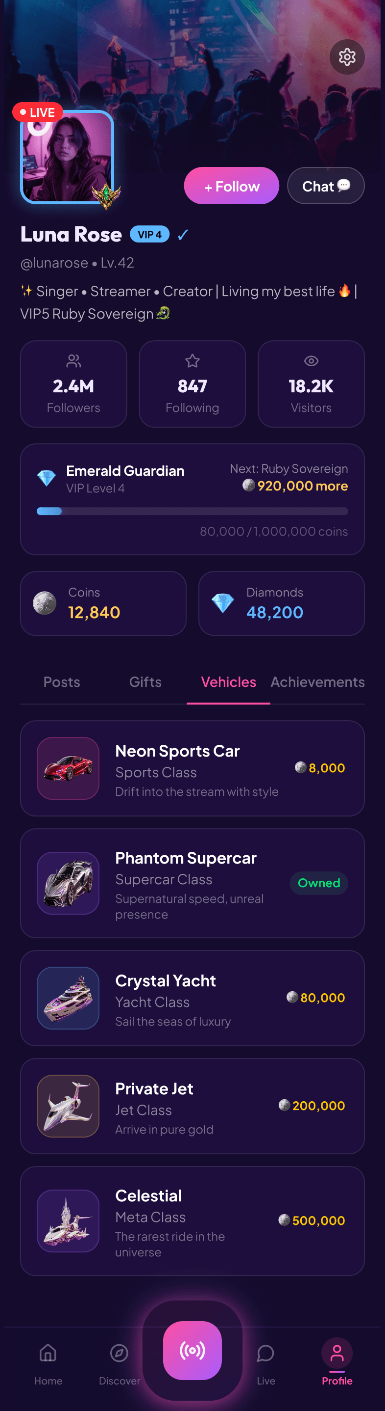
Collectibles · identity with room to grow
08Keeping the experience social
The product still needed to feel human. Recognition and progression could support engagement, but they should never become more important than the actual relationship between creators and their communities.
Live content
Interaction
Recognition
Balancing those three without letting any one dominate became one of the central UX challenges.
09Premium without becoming heavy
The experience needed a more aspirational feeling than a casual social app. But premium does not have to mean visually complicated. I wanted the product to feel expressive and energetic while keeping:
Clear hierarchy
Focused actions
Readable screens
Strong contrast
Space around important content
Consistent interaction patterns
The interface needed enough personality to feel memorable without competing with the creators themselves.
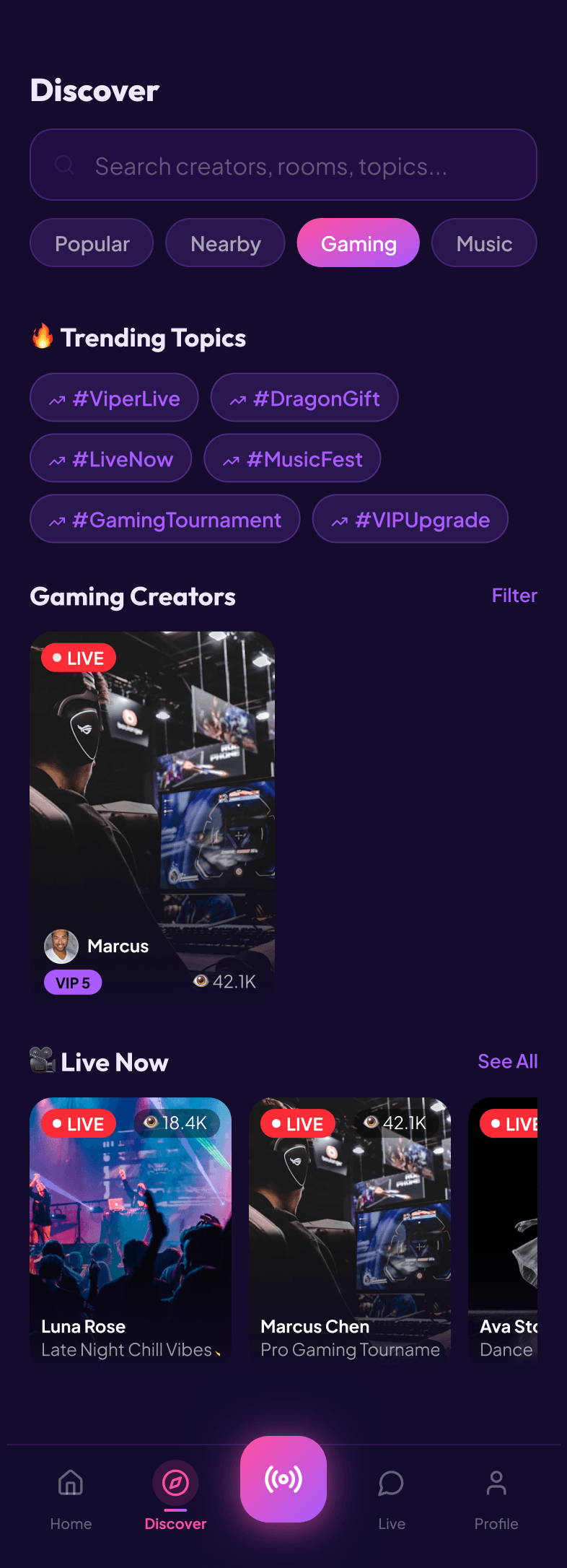
Gaming · personality without noise
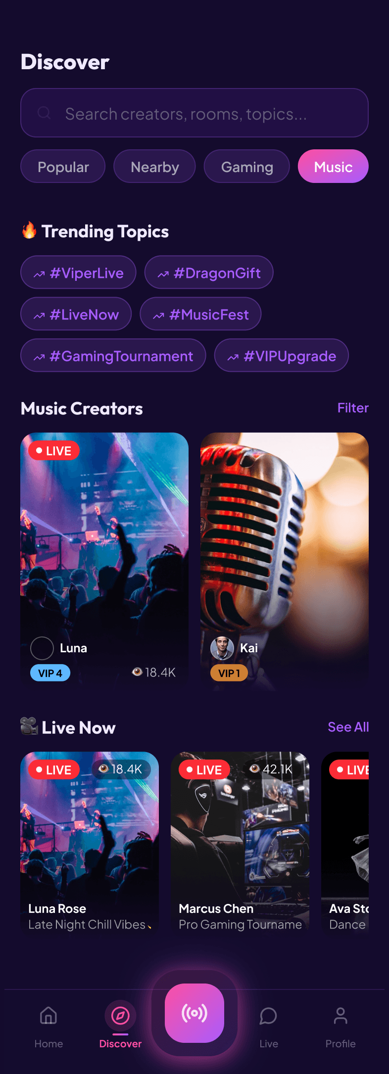
Music · the same system, a different mood
10Designing for an MVP, not the final ecosystem
One of the most important decisions was accepting that the first version did not need to express every future idea. The product could eventually support deeper systems around recognition, progression, collectibles, status, virtual rewards, and rankings.
But the first experience still needed to work without requiring someone to understand a complicated economy on day one. For me, the MVP was about establishing the core relationship:
Discover
Watch
Participate
Support
Be recognized
Return
Everything more advanced could grow from that foundation.
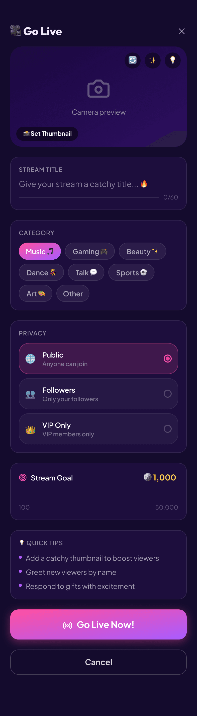
Going live · category, privacy and a stream goal, kept to what the first release needed
11How Velora evolved later
The Velora direction continued developing after my original MVP work. The later brand system formalized Velora as a premium creator economy and live-streaming platform, with a stronger focus on recognition, progression, community identity, virtual gifts, VIP status, collectibles, rankings, and visible social status.
That later direction includes systems such as:
VIP progression
Badges and crowns
Frames
Prestige vehicles
Virtual gifts
Achievements
Rankings
Collectible rewards
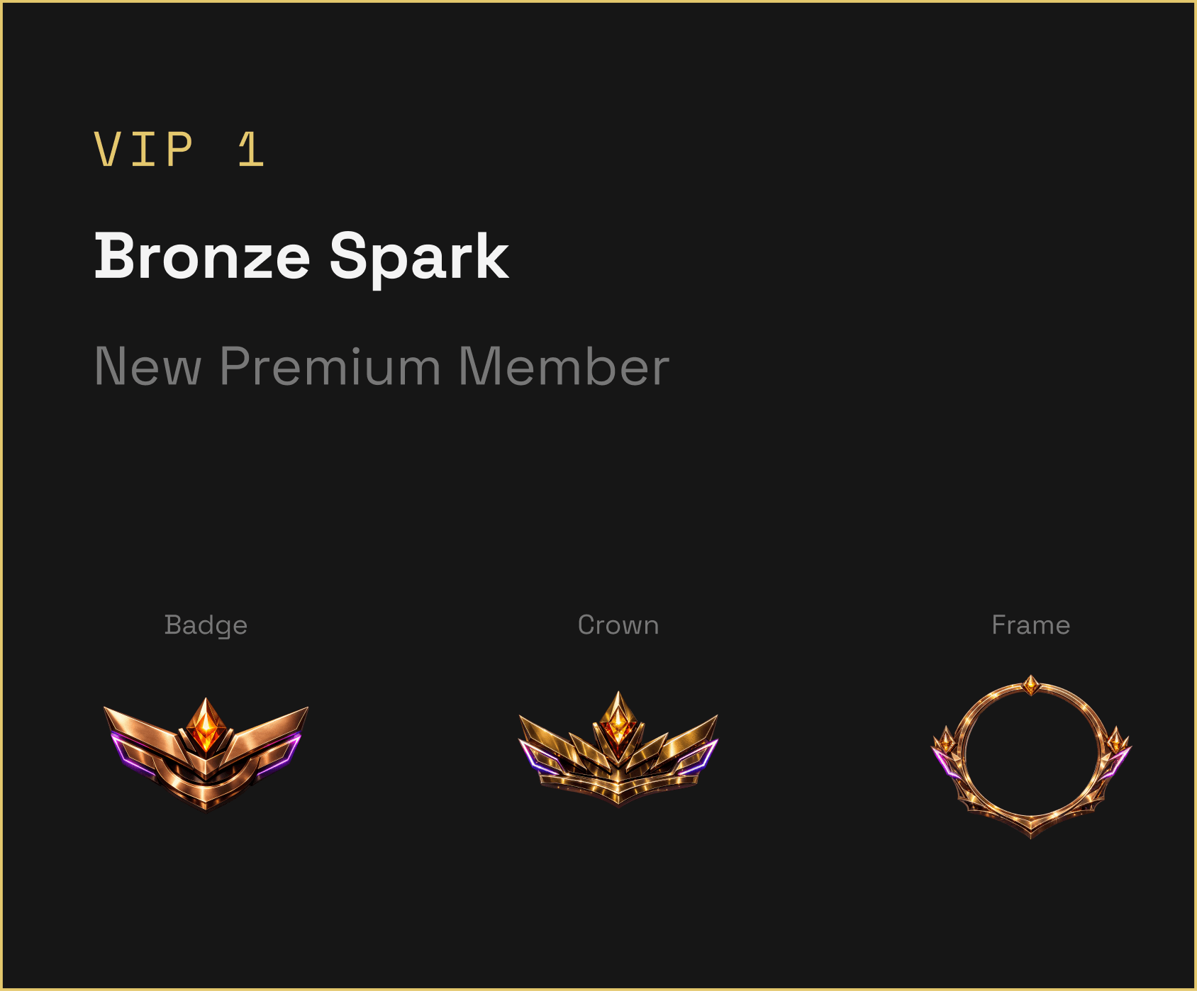
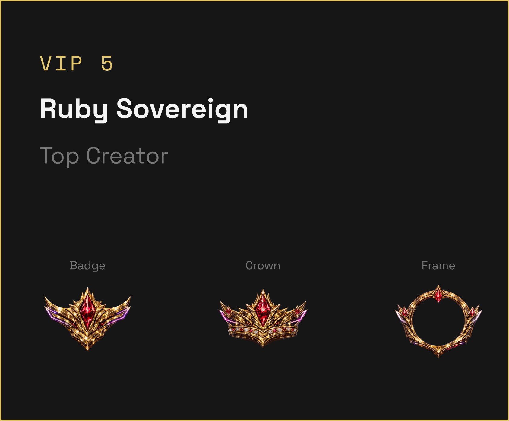
The VIP ladder runs across five tiers, each carrying its own badge, crown, and profile frame:
VIP 1 · Bronze Spark · New premium memberVIP 5 · Ruby Sovereign · Top creator
I present this evolution separately from my original MVP work rather than implying that every later system was part of the first design. It is useful context because it shows the original idea had room to grow into a much larger product ecosystem.
12What I would keep from the later direction
Status must be visible. Progress must be clear. Rewards must feel valuable.
The later guidelines define the experience around recognition, progress, collection, social proof, and reward, while also emphasizing that premium should remain elegant rather than complicated. Those principles turn engagement into something users can actually understand.
Not “you are progressing somewhere”, but: this is where you are, this is what you earned, this is what comes next.
13What this project shows about my design work
Velora was different from redesigning an existing product. There was no mature experience for me to reorganize. I had to take a broad client idea and start giving it product shape.
That meant thinking about:
What belongs in the MVP
What can wait
What creates the core experience
How engagement should work
How recognition affects UX
How social identity can grow over time
How to make a potentially complex system feel understandable
The final screens were one part of that work. The bigger challenge was deciding what kind of experience those screens needed to create.
14If I were designing it today
01
I would validate the creator and supporter loop first
Before expanding the reward economy, I would test whether the core loop itself creates enough value: discover, join, participate, support, return. If that loop is weak, adding more rewards will not fix the product.
02
I would separate MVP progression from the future economy more clearly
Velora has the potential to support a deep status and collectible system. Today I would define very clearly what progression belongs in the MVP, what users need to understand immediately, what should unlock gradually, and what belongs to future releases.
03
I would prototype the rewarding moments earlier
Velora depends heavily on moments like sending support, receiving recognition, unlocking progress, earning status, and celebrating achievements. Today I would prototype those interactions with motion much earlier rather than treating animation as polish at the end. For this kind of product, the feeling of the reward is part of the UX.
15Closing thought
The challenge wasn’t adding gamification to live streaming. It was deciding how participation could feel seen, valuable, and worth coming back for.