Travelers exploring
Looking for places, experiences, or inspiration.
Turning an existing travel platform into a clearer mobile experience
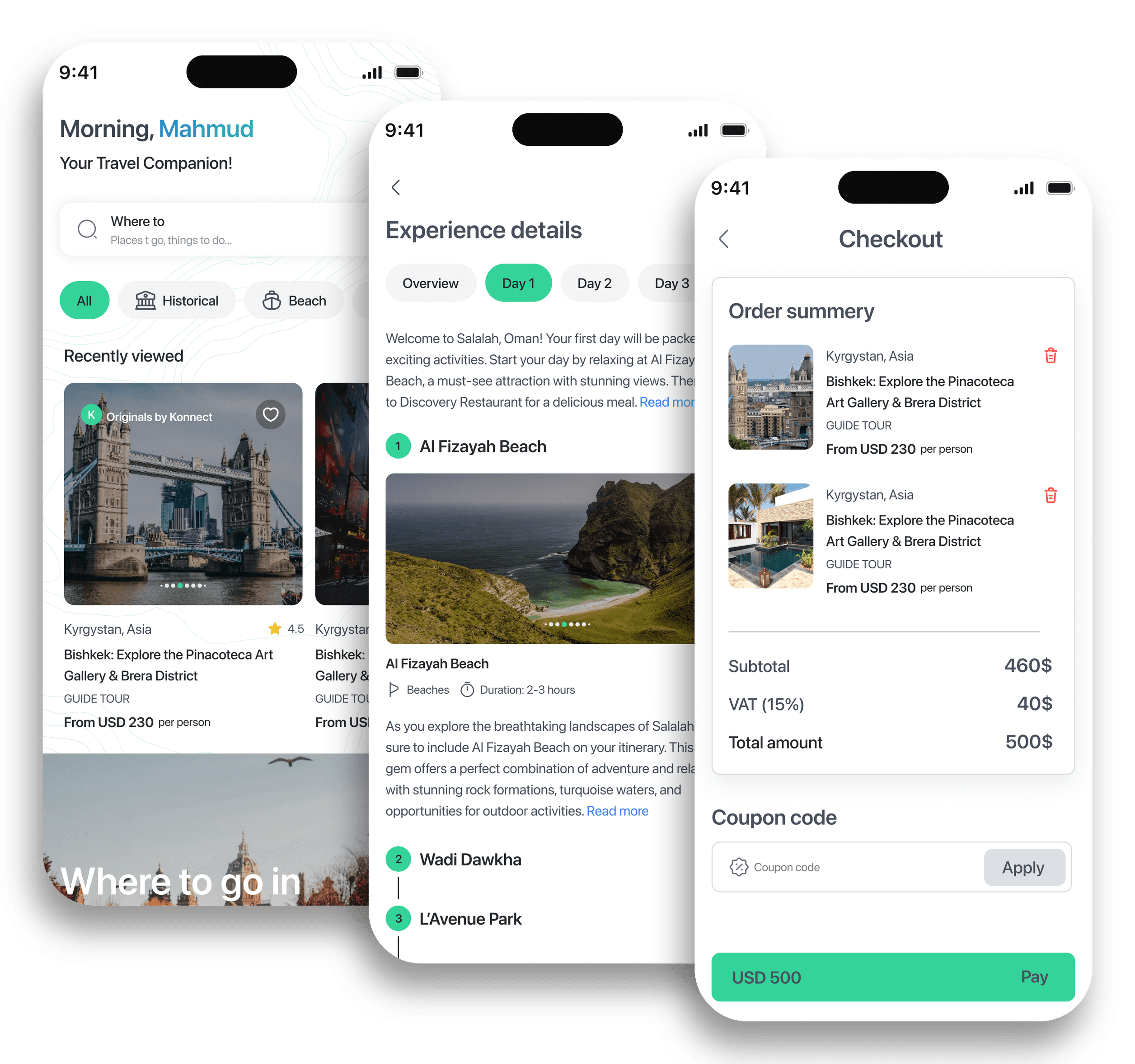
ViaKonnect already had a web platform for discovering and purchasing travel guides and experiences. The product worked, but the experience had never really been designed for mobile.
I started by using the existing product myself, then restructured the experience around clearer journeys, mobile navigation, real content, and the business rules behind the product.
I owned the UX structure, flows, wireframes, and interaction logic, and worked closely with the UI designer and technical team through implementation.
Outcome: a dedicated mobile product launched on iOS and Android.
The product already worked. The experience didn’t.
The existing platform had:
But it also had:
The challenge was not to redesign a few screens. It was to understand the product well enough to reorganize it for mobile.
One of the first things I asked for was a free guide so I could complete the purchasing journey myself. Looking at an account that already owned a guide was not enough. I needed to understand the purchasing flow itself.
I wanted to see:
Understand the real journey before trying to improve the interface.
ViaKonnect needed to support different travel behaviors.
Looking for places, experiences, or inspiration.
Making more deliberate decisions around a complete trip.
Sharing destination knowledge through guides and travel content.
The experience needed to work for someone who already knew where they wanted to go and someone who was simply exploring.

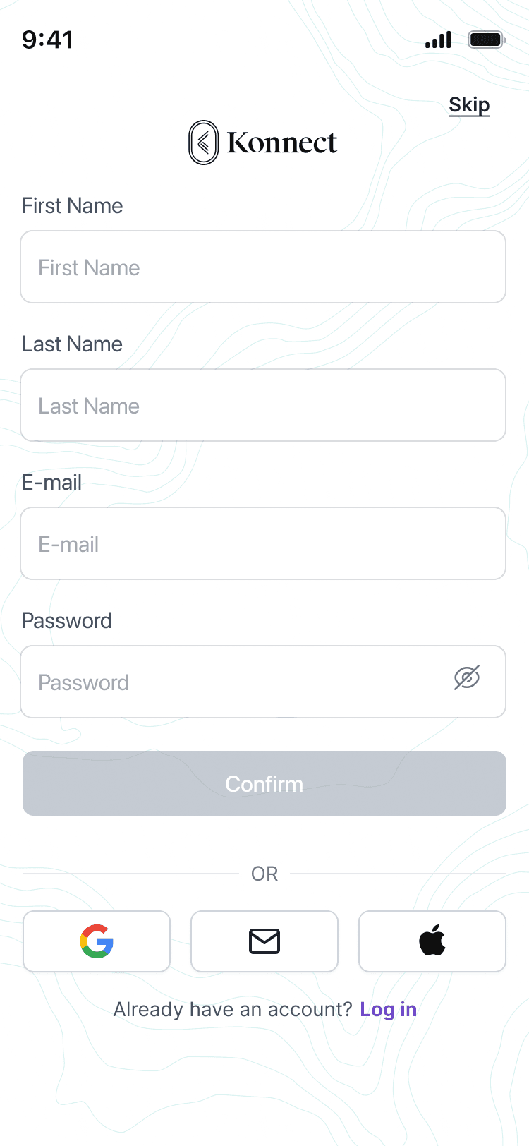
A large part of the UX work was about organizing what already existed. The product included destinations, experiences, guides, creators, maps, tips, transportation, purchased content, and account information.
I structured the mobile experience around simpler questions:
These questions shaped the information architecture and core journeys.
I did not want the app to feel like the website inside a smaller screen. The product needed its own mobile logic.
I mapped the experience around:
Design connected journeys, not isolated screens.
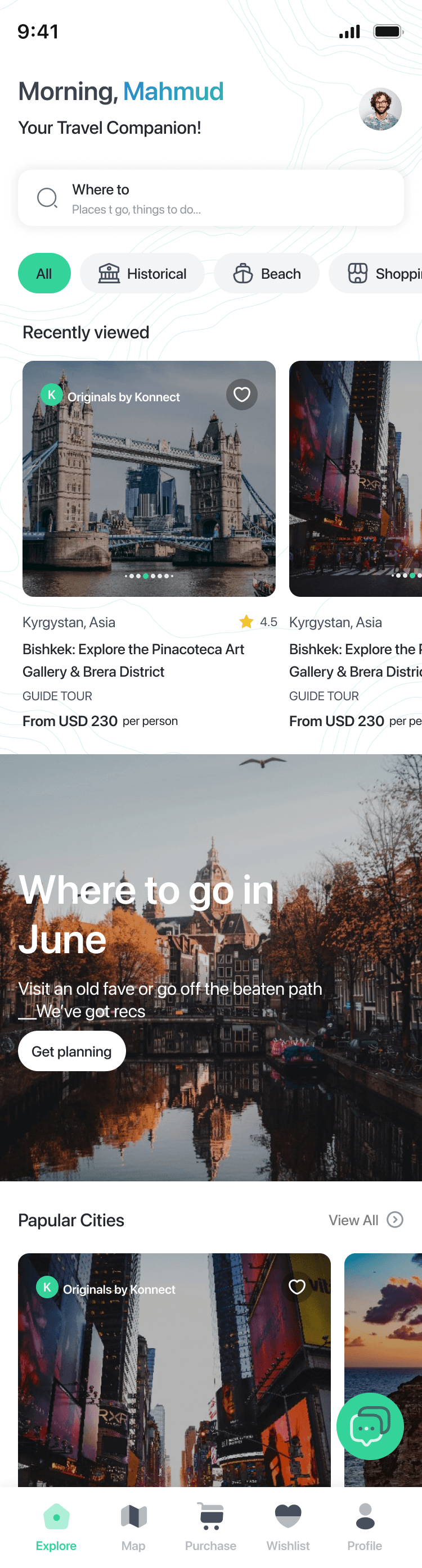
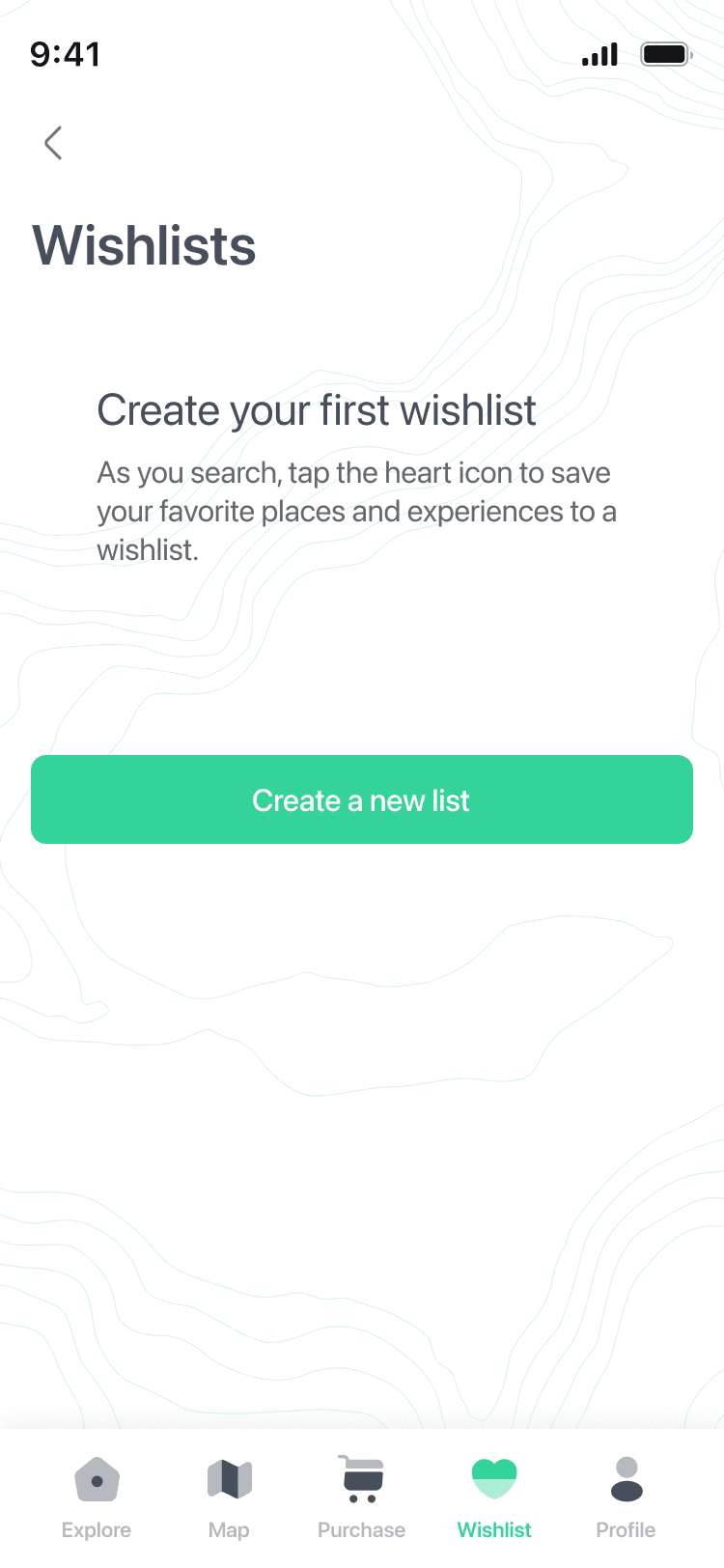
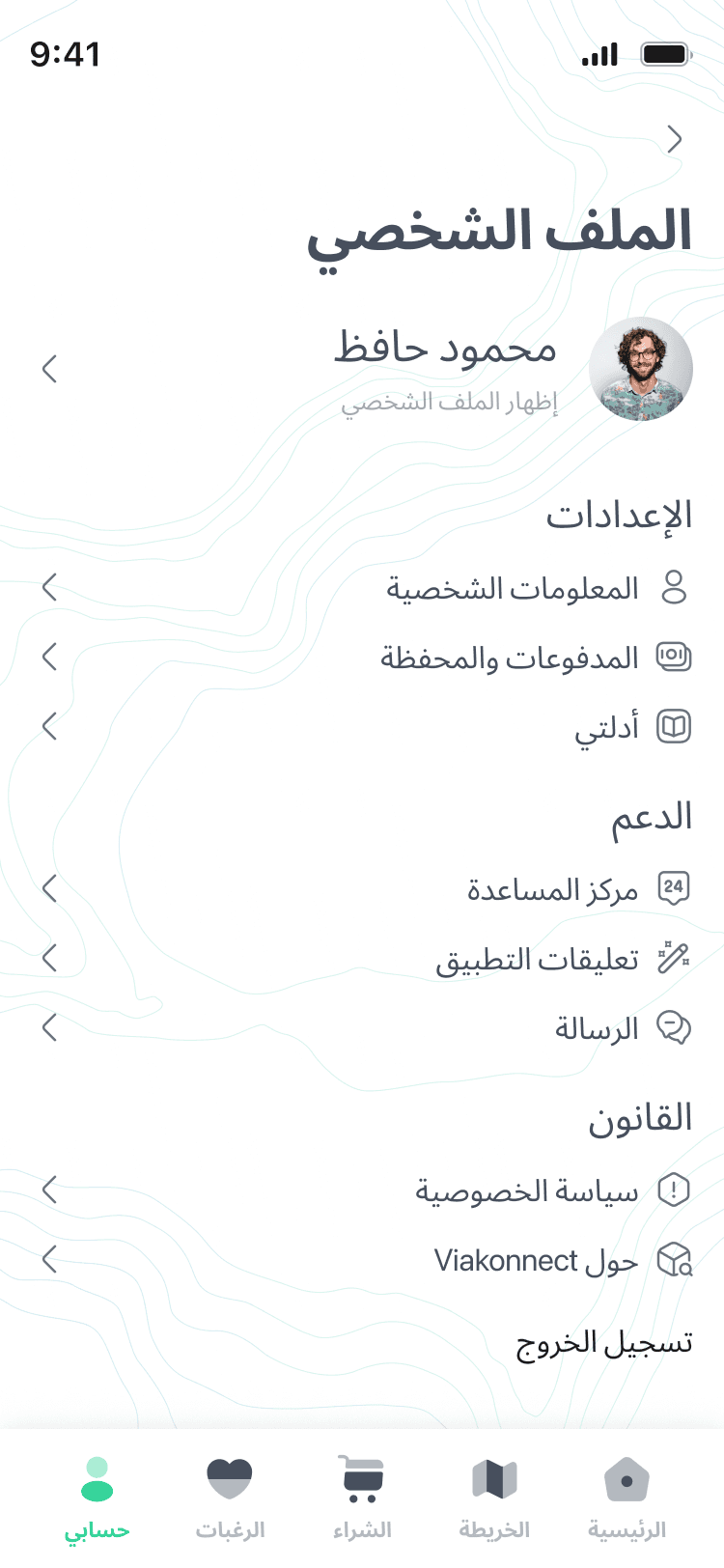
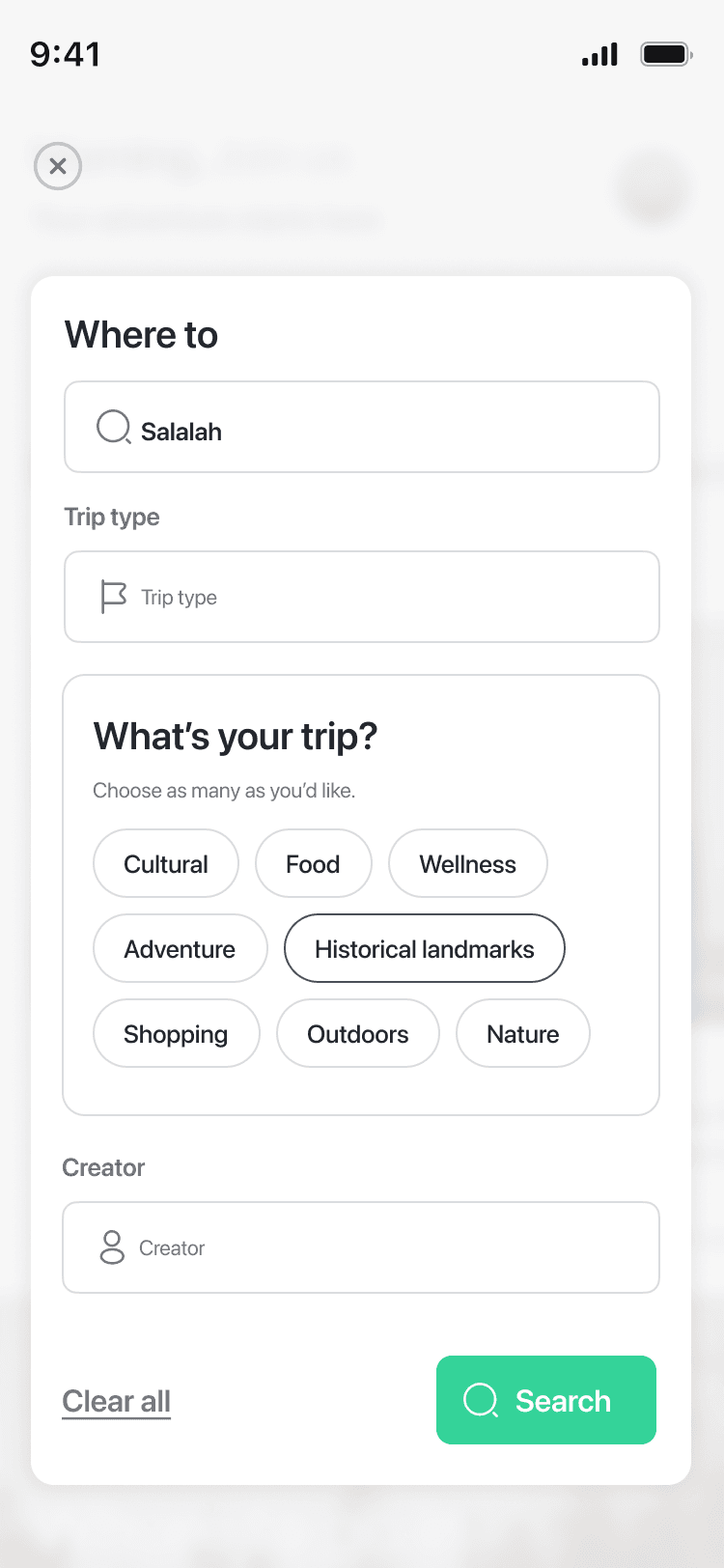
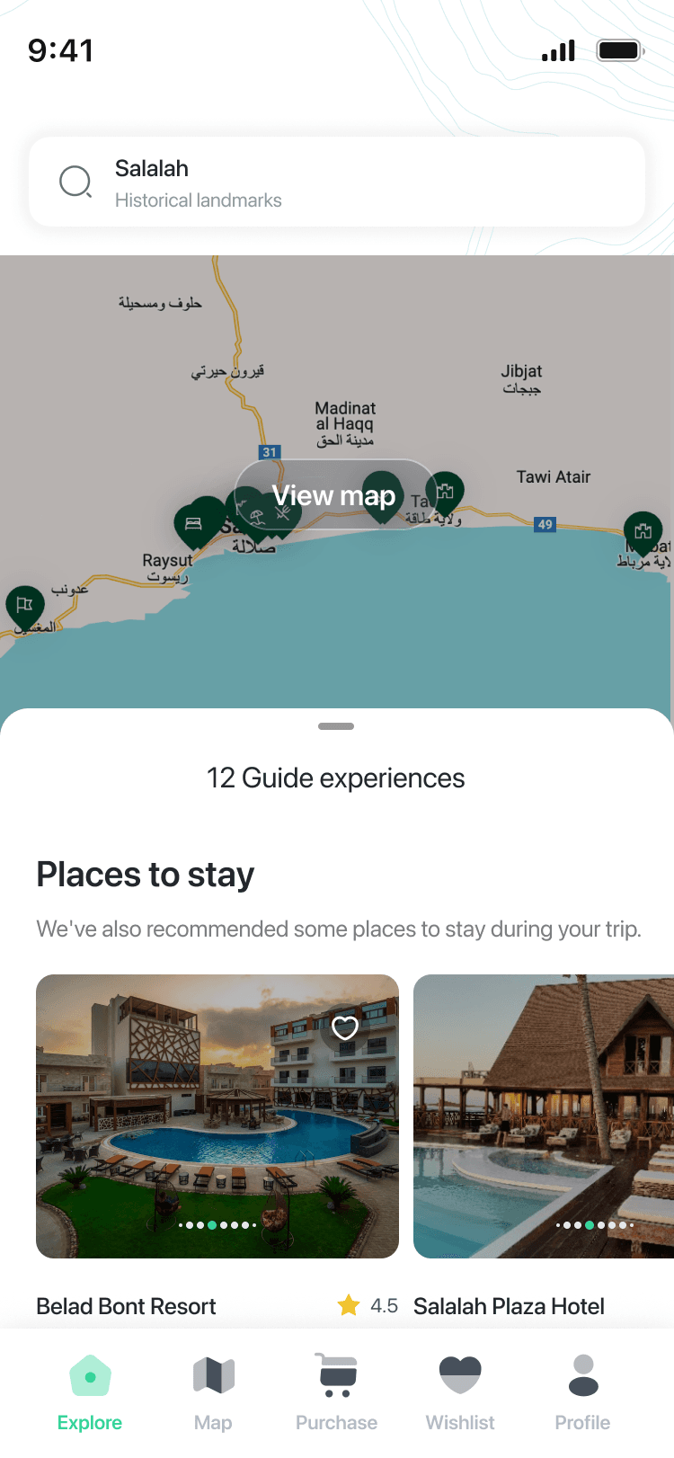
There was a lot of travel content, and discovery could easily become overwhelming. I structured discovery around destinations, experiences, search, filters, creators, and maps, supporting both casual exploration and intentional search.
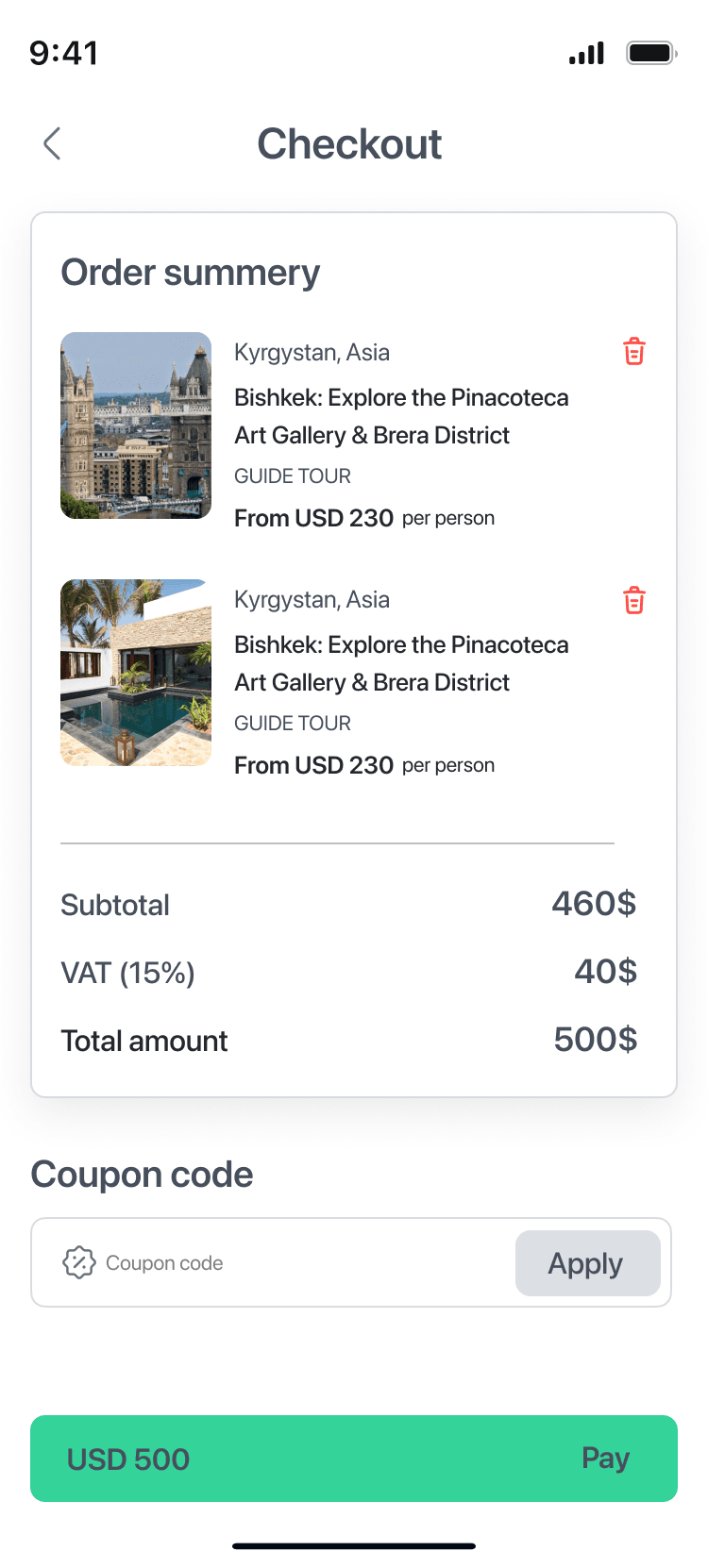
Purchasing was more than checkout. Mapping the flow first clarified when authentication was needed, what users needed before purchase, what changed after purchase, and where purchased content should live.
The purchase needed to feel like the beginning of ownership, not the end of the journey.

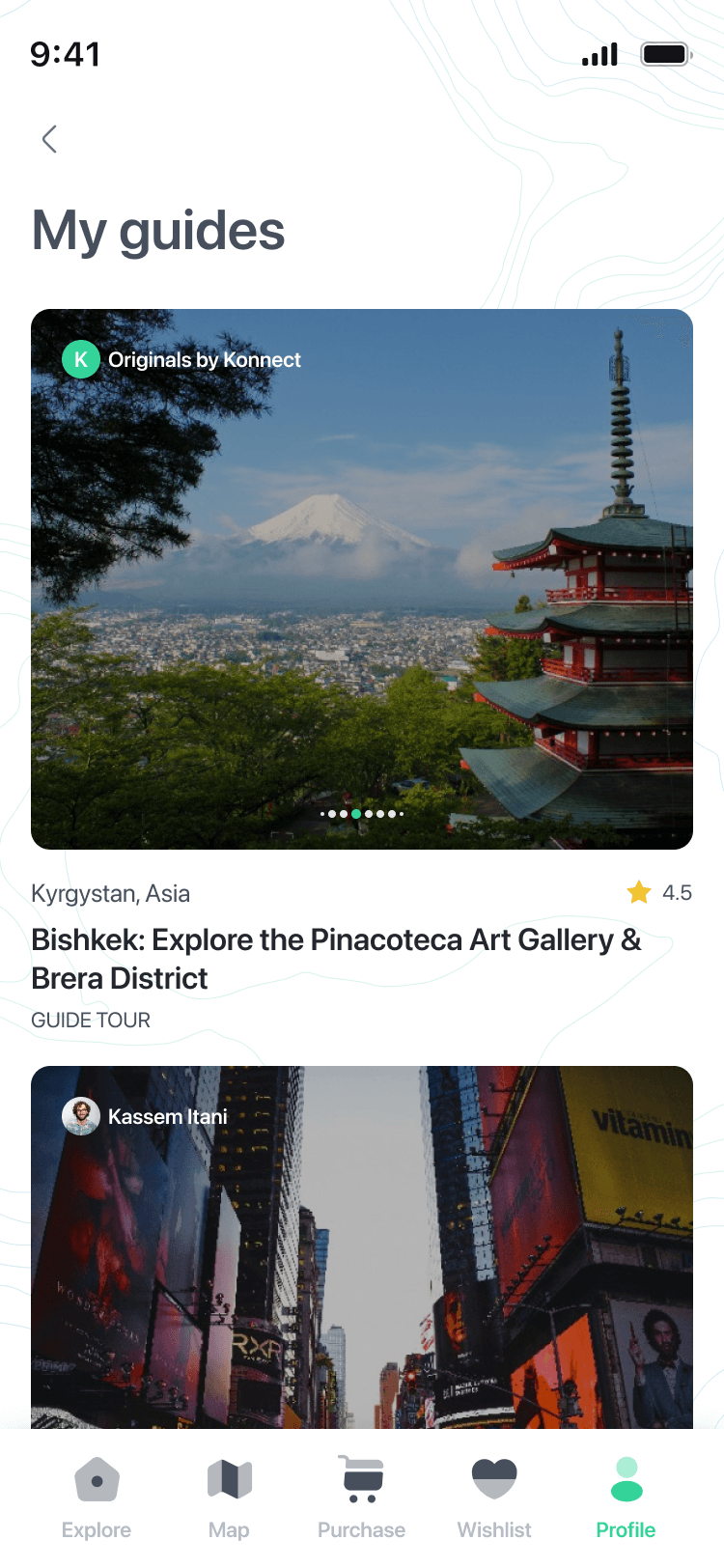
One small question revealed a much larger UX decision: can someone delete a guide they purchased? The answer was no. That changed My Guides from a temporary content list into a permanent personal library, affecting ownership, post-purchase access, content hierarchy, empty states, and the relationship between discovery and purchased content.
A missing delete button was not just a UI choice. It came from a product rule.
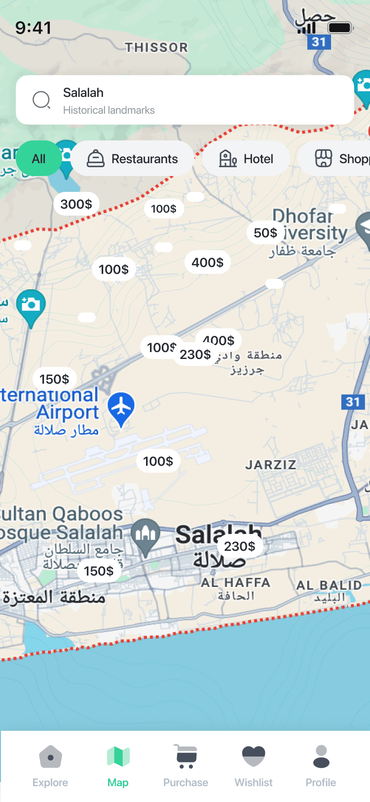
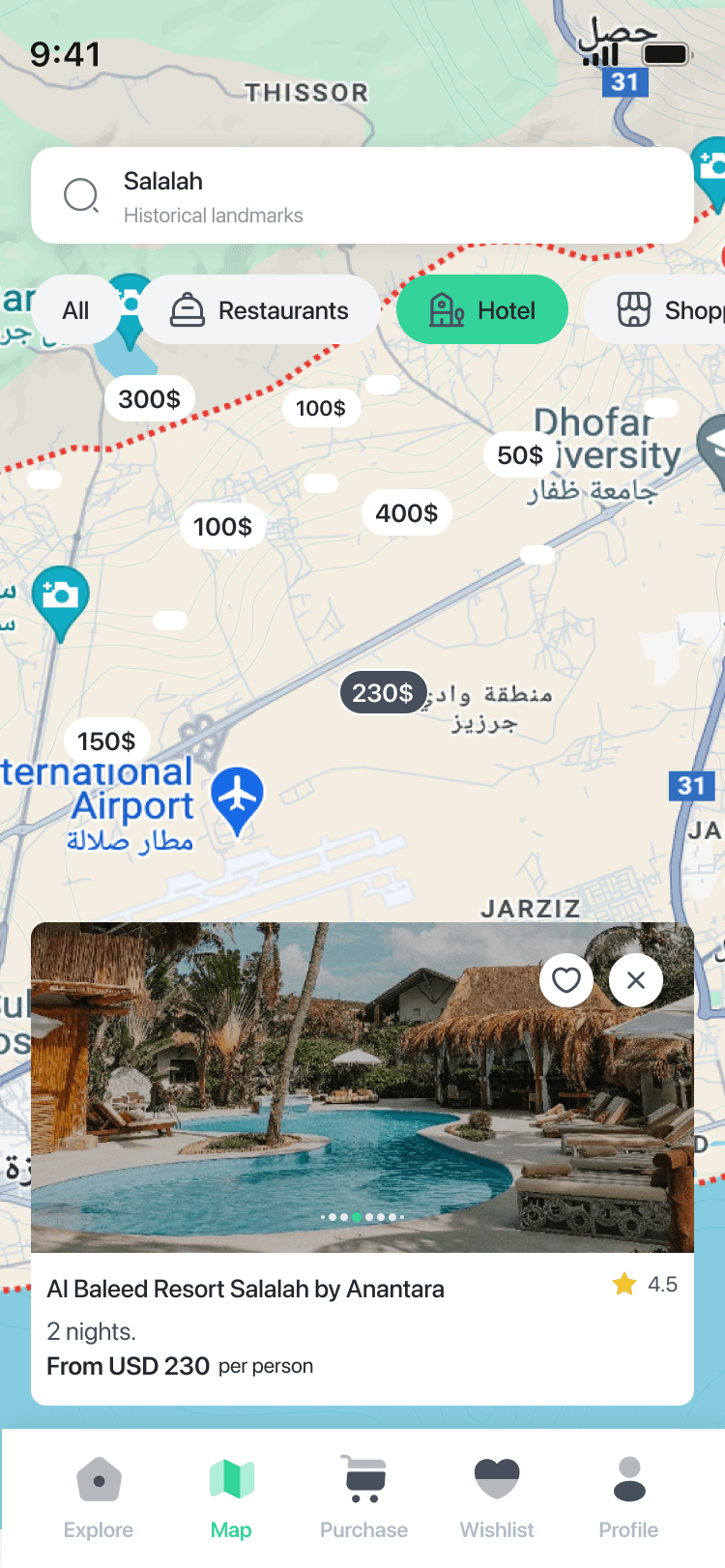
Maps seemed obvious for a travel product. The real question was what the map should actually help someone discover. ViaKonnect was built around guides and travel experiences, not general hotels and restaurants, so the map stayed connected to the actual product offering and available data.
A feature should fit the product behind the interface, not only look useful on the screen.
Placeholder content made the product look simpler than it really was. Real experiences could contain transportation details, verified guide information, destination context, daily activities, tips, maps, recommendations, and purchase information.
I asked for a complete real experience before locking parts of the design. Real content exposed:
Real content exposed problems that placeholders were hiding.
My work focused heavily on the UX foundation:
I then worked closely with the UI designer to translate that structure into the final visual experience. My responsibility was to make sure the interface continued to support the intended journey, the right hierarchy, the business logic, real content, and technical constraints.
Once development started, new questions appeared: backend constraints, missing business context, interaction questions, data dependencies, evolving states.
Figma and Jira helped, but they were not enough on their own. I stayed involved with the technical team, clarified flows, and introduced short direct sessions when the developers needed more context behind the experience.
For me, handoff was part of the design process.
I tested early Android builds as they became available instead of waiting for the entire product to be complete. I reviewed onboarding, sign up, personalization, navigation, search, filters, dates, maps, guide access, and missing states.
I also separated incomplete backend behavior from actual UX issues. That helped us catch experience gaps while the product was still being built.
ViaKonnect launched on iOS and Android.
The mobile product connected:
The product continued evolving after the initial launch and reached real users through both app stores.
Good UX often starts before the interface.
Some of the most important design decisions came from:
The screens were the visible result. The real work was creating enough clarity around the experience that those screens made sense.
I would bring travelers into the process earlier and validate the main discovery, planning, and purchasing journeys before locking the structure.
I would map real content and edge cases earlier so the product could be designed around actual information from the beginning.
I would use AI-assisted interactive prototypes to explore and test more behavior with users and engineering before production. Not to replace UX thinking, but to reach better decisions faster.
The biggest change wasn’t turning the website into an app. It was turning a complicated product into an experience people could understand on mobile.